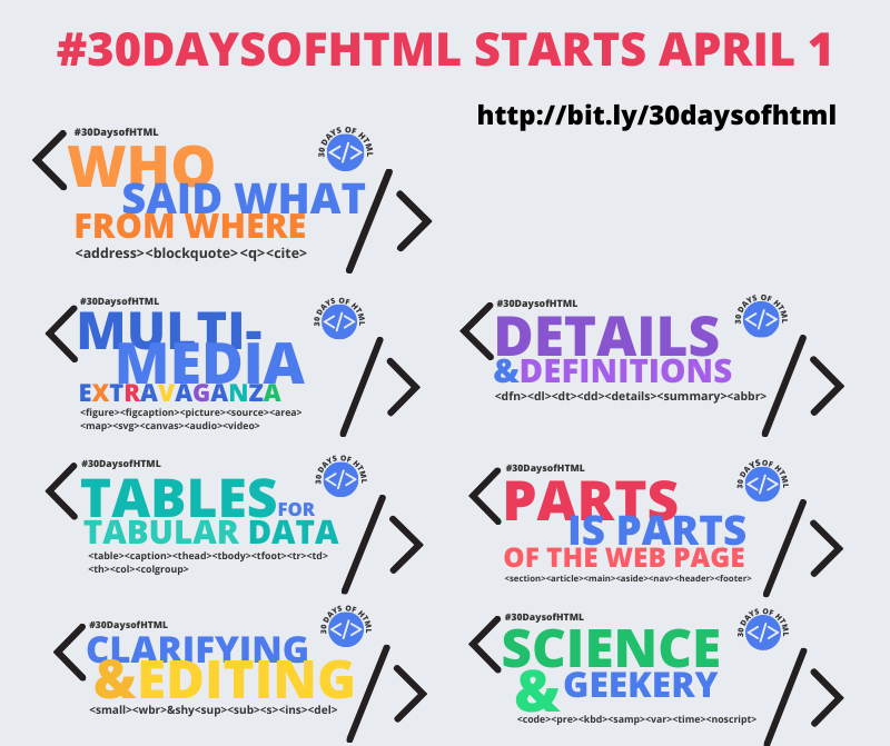
Today I received the best compliment on my #30DaysofHTML course, even before it launches.
This gets to the heart of why I started this challenge and my thinking behind it.
How HTML is normally taught
HTML is the scaffolding behind a web page. It’s as exciting as framing a house, or [playing bass or drums in a rock band] (https://jen4web.substack.com/p/use-the-full-frontend-or-create-junk). In other words, there’s some artistry, but it’s underappreciated by most. Done right, it’s in the shadow of way more exciting and interesting elements of the project. However, without it, nothing else matters – HTML is foundational to a website.
When developers teach new developers HTML, it’s presented as a necessary evil. As little time as possible is spent on it, because everyone wants to get on to making things pretty and interactive – neither of which is a thing with HTML. Quick quick, here’s a tag, here’s an attribute, open/close things – whew, let’s move on.
As a result, HTML is the mushroom of the web world. It’s kept in the dark, and it eats a lot of crap by people who see nothing to love.
I love mushrooms
The purpose of the Hypertext Markup Language is to identify the parts of the web page: paragraphs, lists, headings, links, addresses, quotations, and so much more. How many times have I said this sentence in 20 years of teaching?
But finally, I made a connection: HTML is intimately tied to the story of the website.
Everyone wants to be heard and understood. Everyone wants their story heard. Great HTML is the way to communicate your story to the world.
When I was 14 months old and hungry, I would pull on my mother’s pant leg, point to the counter looming over my head, and grunt, “Cookie.” (Or so my mother says. I do not remember.) She would respond by giving me fruit, crackers, a bowl of dry Cheerios, or whatever else a 14 month old eats. Not a cookie, no matter hard I tried. Or she’d tell me it was almost dinner time and go away and leave her to finish it.
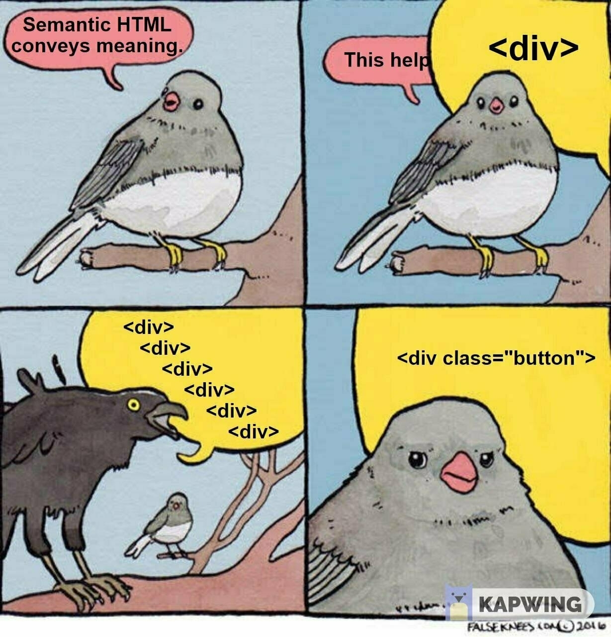
Consider that your crappy HTML is telling this same story. If your website is nothing but one < div > after another, you’re just saying COOKIE COOKIE COOKIE. You’re 14 months old, with a limited grasp of vocabulary.

Telling the wrong story
So. How do you convince developers, who just love everything pretty and interactive, that their framing sucks and doesn’t work? Their code that sits on top of it works just fine. Framing is SO BORING.
Well, accessibility, of course! It’s absolutely critical. Accessibility should start at the beginning. It should always be incorporated in the site. Good accessibility starts with meaningful HTML.
But – what the accessibility advocates are doing is not effective to get developer attention. They are, unfortunately, ignored for the most part.
We’ve (maybe) gotten (some) busy developers to feel guilty about their bad HTML. But changing it takes effort. Learning what HTML elements are available takes time and research. Time that could be spent learning the latest JavaScript framework.
Time for a new story with new framing.
#MakeHTMLExcitingAgain
If we focus on HTML’s syntax, that’s not interesting. What’s interesting is the meaning conveyed behind the elements. Why choose one element over another? How does that element contribute to the website’s story?
30DaysofHTML incorporates the following concepts:
-
Focus on the meaning behind the elements. When should something be used or not used?
-
Don’t overwhelm with all of the edge cases and complexity. Provide just enough information to feel like you know a little bit, and provide links to everything else.
-
Identify any misconceptions about the element. HTML looks like English. The < address > element, for example, looks like it’s for a postal address. However, it can be used for any contact information associated with an article or website author, including phone numbers, email address, social media links, or even geographic coordinates. Who knew that? That’s interesting and fun and different.
-
Remove the pretty and interactive, so learners are forced to focus on the scaffolding. We aren’t concerned with cross-device presentation or UX or anything else. It’s black text on a white page. There’s nothing else to do here… by design.
-
Encourage application, reflection, and discussion. Not only should there be a little reading, but there should be some examples and problems to try too. Maybe the occasional quiz. Encourage readers to share their work and comment on each other’s markup and approaches. Put the discussion on the meaning we’re trying to convey.
-
And finally, make it fun. Make some fun graphics, throw in a few emojis, use all of the web writing techniques to break up content with headings and lists. Write in a fun and informal style.
Hook 'em with a hook
["< address > should be used for addresses. You guessed that already. But what kind of addresses, and in what context?"] (https://jen4web.substack.com/p/address)
Draw the reader in. Make them curious. Conflict is interesting. The lure of something that perhaps you don’t know is intriguing.
I also sent out a [“Night Before”] (https://jen4web.substack.com/p/twas-the-night-before-30daysofhtml) email, explaining what to expect and how it will all work. This sets anxious learners at ease, and it sets expectations and generates interest. It also sets metrics for what success looks like.
Give them a familiar format
-
The “X Days” format is popular at this moment. People talk about #100DaysofCode and #100DaysofNoCode and such. Why not #30DaysofHTML? Fortunately, it explains everything you need to know in the hashtag. 30 days, talking about HTML.
-
Email is the format for delivery. It’s simple, easy, and everyone has it. Using Substack, I also create a website, and it has interesting discussion features for sharing work.
-
In Silicon Valley speak, “reduce friction.” The email goes in your inbox. You read it when you’re ready. Another appears tomorrow. You’re getting 30 emails in 30 days. What’s not to love?
Time to start!
This is the start of my 30 day journey. I hope to learn more about HTML, but mostly, I hope to learn more about offering instruction in this format. What works and what falls flat? What is the response? What would I do differently next time?
I’ll write more about this in May.



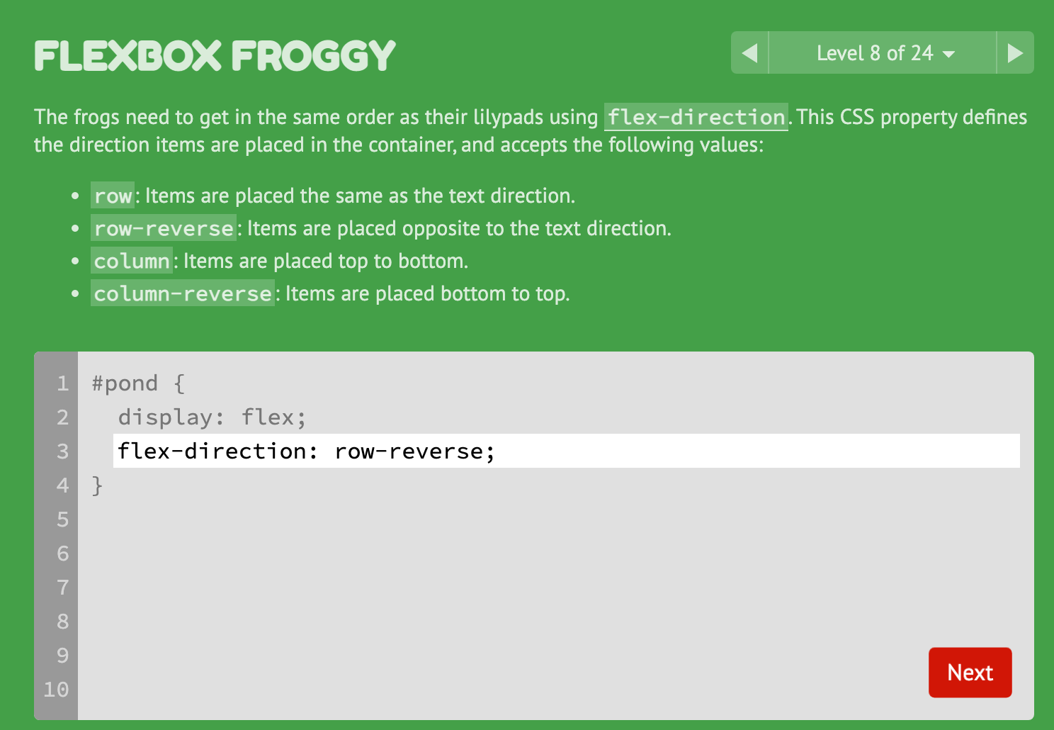
 Level 8: Frogs are not quite aligned with their lilypads to start.
 After typing in the appropriate Flexbox CSS properties and values, the frogs align to their lilypads. Adorable.
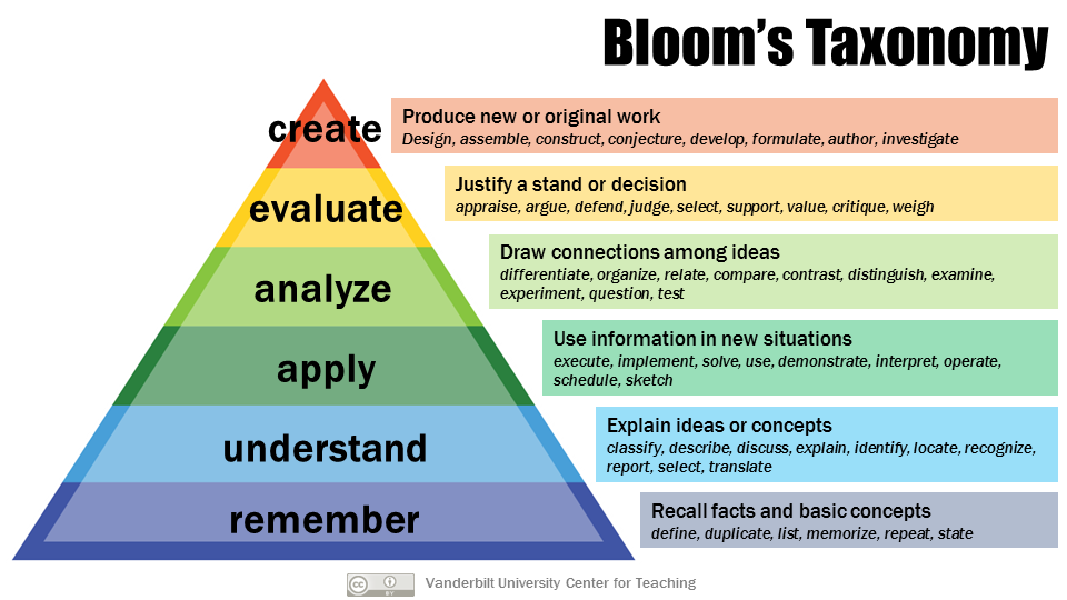 Armstrong, P. (2010). Bloom’s Taxonomy. Vanderbilt University Center for Teaching. Retrieved October 28, 2022, from https://cft.vanderbilt.edu/guides-sub-pages/blooms-taxonomy/.


